


Created by real people: Every post we publish is written by our team. AI plays only a small role for adjustments and polishing. We don’t aim for generic SEO content; our focus is on delivering authentic, high-quality value for the community.
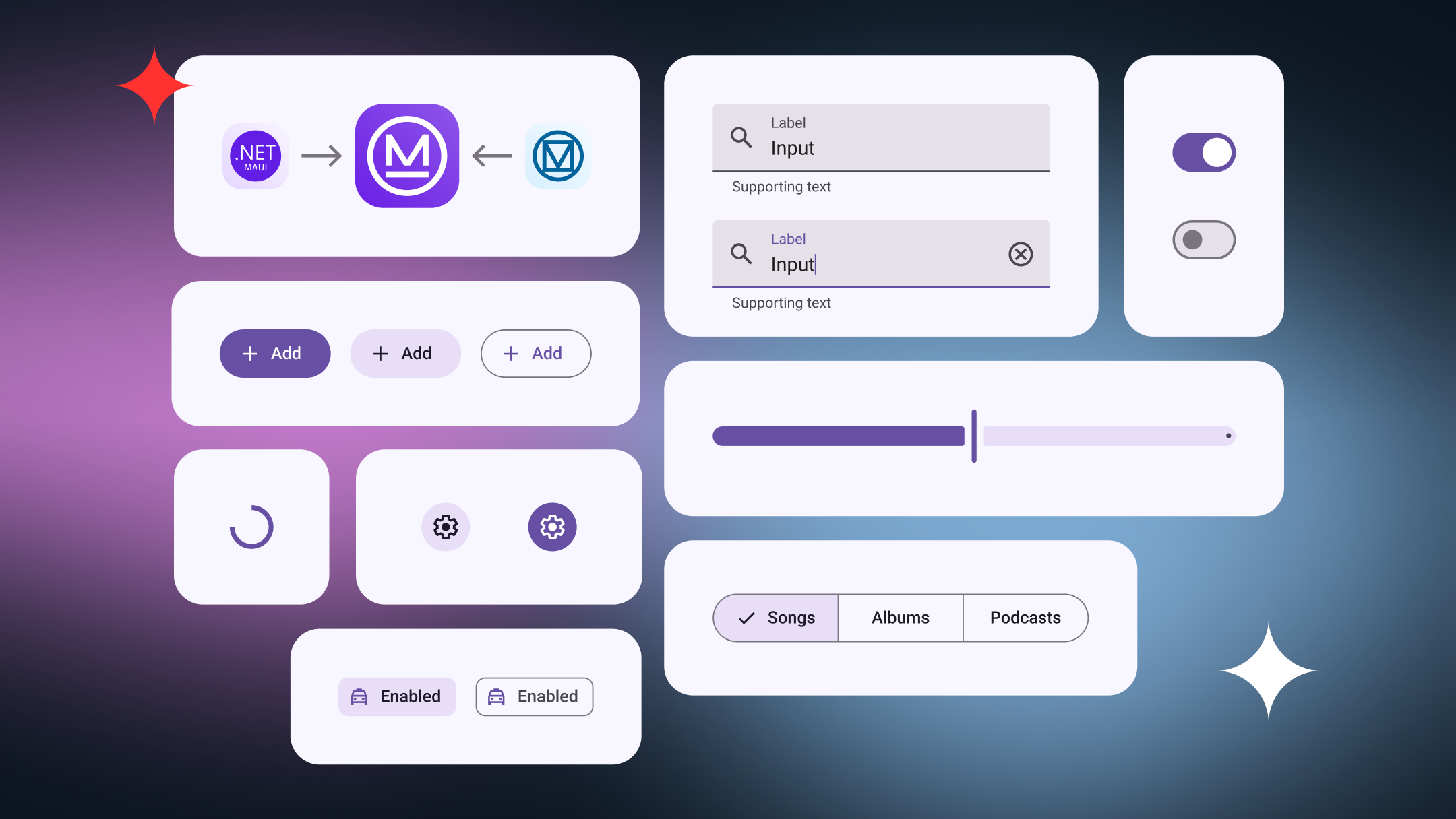
A UI Library Built for Modern .NET MAUI Apps
Maui.MaterialDesignControls is a UI toolkit built for teams working with .NET MAUI who want modern, consistent interfaces without extra complexity. It offers a set of Material Design controls that fit naturally into .NET MAUI projects.
In this post, we’ll look at what the library is, how it helps real projects, and how the recent support for .NET 10 makes it a solid choice for both current apps and future .NET MAUI development.

More Than a Version Number
When a library supports the latest .NET version, it sends a clear message: it’s built with the future in mind. .NET 10 offers long-term support and a more stable platform for teams building mobile apps today.
We recently shared a deeper look at what .NET 10 means for .NET MAUI projects. Updating Maui.MaterialDesignControls to support it was a natural continuation of that work, helping teams move forward without worrying about upcoming migrations or compatibility issues.
What .NET 10 brings to .NET MAUI apps
Our Journey: From a Xamarin Plugin to a Modern .NET MAUI Library • 89K downloads
A few years ago, we built Plugin.MaterialDesignControls to solve a very real problem: keeping mobile UI consistent across Xamarin apps. At the time, it helped us move faster and reduced a lot of repetitive UI work.
As the ecosystem evolved, so did our needs. Moving to .NET MAUI wasn’t just about updating code to a new framework. It gave us the opportunity to rethink the library, simplify its design, and rebuild it around modern performance, flexibility, and maintainability.
More Than Just UI Components
This library is not only about individual controls, but about making UI work simpler and more predictable. Maui.MaterialDesignControls helps teams build screens that feel consistent, polished, and easy to maintain as the app grows.
Instead of solving the same UI problems over and over again, teams can rely on a shared set of components that speed up development and reduce visual inconsistencies across the app.

<material:MaterialTextField
    Type="Outlined"
    Placeholder="Email"
    Keyboard="Email"
    ReturnType="Next"
    Text="{Binding Email}"
    SupportingText="{Binding EmailSupportingText}" />

<material:MaterialTextField
    Type="Outlined"
    Placeholder="Password"
    IsPassword="True"
    ReturnType="Done"
    Text="{Binding Password}" />

<material:MaterialButton
    Type="Filled"
    Text="Sign in"
    Command="{Binding LoginCommand}"
    IsBusy="{Binding LoginCommand.IsRunning}" />

<material:MaterialButton
    Type="Text"
    Text="Forgot your password?"
    Command="{Binding RecoverPasswordCommand}" />
_ = _materialSnackbar.ShowAsync(
    new MaterialSnackbarConfig($"Email: {Email}")
{
   LeadingIcon = new MaterialSnackbarConfig.IconConfig("ic_button.png")
});
From First Release to Long-Term Maintenance
As .NET MAUI apps evolve, UI issues tend to show up: small visual inconsistencies, repeated code, or screens that suddenly become harder to change than they should be. Most of the time, this isn’t the result of bad choices, but simply the lack of a shared structure for building UI.
With Maui.MaterialDesignControls, teams start from a well-defined UI foundation. Common patterns are implemented once and reused across the app, helping reduce visual bugs, speed up everyday development, and keep maintenance under control as the project grows.
Built for .NET 10: What That Means in Practice
Being built for .NET 10 means the library runs on a more stable and mature platform. Teams benefit from better performance, smoother behavior, and fewer unexpected issues as the framework evolves.
In practice, this leads to a more reliable development experience, easier upgrades, and UI code that keeps pace with improvements in .NET MAUI instead of lagging behind.
Why Different Roles Benefit from the Library

Open Source, Built for Production
We believe that building in the open leads to better software. Open source allows real teams, real apps, and real use cases to shape the library through feedback and contributions.
We don’t treat this as a side project. At Horus, the library is built and maintained with the same quality standards we apply to real-world client solutions, because open source should be ready for production from day one.
What’s Next for Maui.MaterialDesignControls
Supporting .NET 10 is just one step in an ongoing journey. We plan to keep expanding the library with new controls, performance improvements, and refinements based on real project needs.
Maui.MaterialDesignControls is a living project that grows alongside .NET MAUI. If you’re curious, you can explore the library, try it in your own apps, or even contribute ideas and improvements through GitHub. We’re always open to collaboration.
References
Components - Material Design 3
Old MaterialDesignControls Plugin for Xamarin.Forms
What .NET 10 brings to .NET MAUI apps
Thank you for reading
Stay tuned and subscribe to Mobile Dev Experiences to be part of this growing community where we share strategies, insights, and real-world lessons in cross-platform mobile development.


